REACTION: CF Montréal releases new logo ahead of 2023 MLS season


For the second time in two years, CF Montréal have a new logo.
But after flopping in the first attempt, it looks like they have hit the ground running this time around.
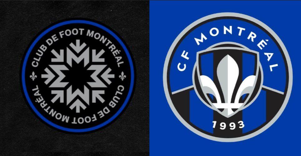
After revealing their now-infamous ‘snowflake’ emblem in 2021, which came as part of a rebrand that saw the Montréal Impact become CF Montréal, it became clear that the logo had to go, something the club had come to terms with recently.
So although the name was something the club was eager to keep around, plans began to find a new visual identity for the club. And now, as of Friday, it’s here, as Montréal revealed that new logo at a media event. 
With a nod to their rich history, exemplified in the inclusion of blue and black stripes, a fleur-de-lys, a shield and the numbers ‘1993’ (the year the Impact were founded), they also combined that with a futuristic look, which is seen both in a new font and a modern circle logo. As a result, it both pays homage to the city's rich history of soccer, and its bright future, tying the two together.
Plus, most importantly for Montréal, it appeared to mostly be a hit on social media, as fans looked to be quite pleased with what their team came up with (although the name remains a key point of contention). Here’s a look at how the Montréal fanbase reacted to their new emblem, which will officially come into use at the beginning of the 2023 season.
Honestly, the only thing I would change, shrink the fleur de lys or center it more. Still prefer the #IMFC logo… but I can work with this. #CFMTL https://t.co/UTlO1GWHjN
— Gio (@GI_Gio3) May 27, 2022
It’s look great but why wait until next year?? Start using it now… and selling new kits! 😎
— Jeff Thompson, Ph.D. (@JeffTPhD) May 27, 2022
- happy "Impact" is only a nickname now (like Habs, Red Devils, Chivas, Vecchia Signora, etc)
— Montrealer 🇮🇹🇲🇽🇨🇦 (@InterMontrealer) May 27, 2022
- I better not hear/see "club de foot" anywhere
- love the crest, colors & 1993
- i hope we go back to the 🔵⚫ stripes on the home & ⚪ away kits
- ⭐ are for championships#CFMTL
The crest wasn’t the problem… it was the generic CF FC name. #Impact was unique.
— Dave. (@dopesuperhero) May 27, 2022
Seul affaire négatif sur le nouveau logo c'est qu'il faut attendre en 2023 😄 #cfmtl #mls pic.twitter.com/JWcZVk011s
— ExpressPitlick🇺🇦 (@ExpressDunlop) May 27, 2022
J’adore le vibe autour du dévoilement de ce nouveau logo du #CFMTL. Le jour et la nuit avec ce qu’on a déjà connu 👊🏼💙🤍🖤
— Dono (@SDono4) May 27, 2022
Bien hâte de voir le logo en petit format et sur de la marchandise. Curieux de voir si ils vont utiliser le bouclier central comme logo secondaire. Bien content overall #cfmtl
— William Bédard (@WillBedMich) May 27, 2022